
Presentation Skills
Microsoft PowerPoint 97
| Schedule |
| SH3 |
| U S Computer Lab |
| Haverford Site |
|
|
| GroupWise |
| Novell Network |
| Presentations |
| Spreadsheets |
| Web Page Creation |
| Word Processing |
| World Wide Web |
| Links |
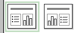 |
To insert a chart in a PowerPoint slide, start by using one of the two chart layouts as shown to the left. |
| This generates a blank slide that includes a section like the one shown on the left, allowing you to begin creation of the chart. Double click on the icon. | 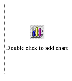 |
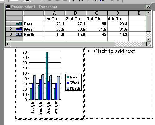
A datasheet will appear, allowing you to input data on which the chart will be based. The datasheet will already contain sample data. Type in your data, replacing the sample data, as appropriate. (If the data already exists in a table or spreadsheet, you should be able to copy and paste the data from the original source.)
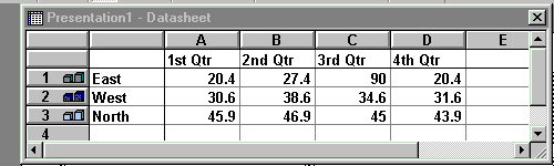
When working with the Datasheet, note the difference in column and row heading labels. Raised labels indicate that the column or row will be included in the chart. Flat labels indicate that the column or row will not be included in the chart. You can double click on the column or row to change its status. (In the example below, columns A through D have raised labels and rows 1 through 3have raised labels. Column E and row 4 have flat labels.)
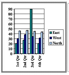
After you complete the datasheet, you can click on the slide to return to it and to see the chart. You can right click on the chart to customize the features of the chart.
Use the links below for tips on how to perform other Presentation functions using Microsoft PowerPoint 97.
- Create a PowerPoint Presentation
- Choose appropriate PowerPoint slide layouts
- Change font in PowerPoint
- Set Font Size in PowerPoint
- Set Font color in PowerPoint
- Use background in PowerPoint
- Include a graphic file in a PowerPoint slide
- Include a graphic from the Web in a PowerPoint
Slide
- Create a table in PowerPoint
- Create a chart in PowerPoint
- Save PowerPoint file
- Save PowerPoint file in 2 places
- Open existing PowerPoint file
Copyright © 2001 Bruce LeNeal Adams. All rights reserved.
Questions
and comments to bladams@msn.com